 How To Create Horizontal Navigation Bar With Dropdown Menu Multi Level And Function Hover Effect? For Indonesian, you might search for this words to find this article: Bagaimana Cara Membuat Navigasi Bar Horizontal Dgn Fungsi Hover Dan Menu Pulldown Dan Slidedown Dan Dropdown?
Well, now i wanna discuss about how to create Horizontal Menu with dropdown and hover effect function included. This is realy a good enough tutorial to read, especially if you're a Blogger newbie. I'm sure that this navigation bar will undoubtedly make your blog looks greater, more profesional, and more adorable than how does it look like currently.
I'd say, the good news is that here i'm going to tell you "by detail" how to create that dropdown menu on Blogger blog exactly. Yes true my friend, i'm going to tell you by detail. Yes true, i'm talking as though i'm the one who created the code myself, where the fact i'm not. :)
If you're like many blogger newbie that wish their blogs had dropdown menu on its navbar, and searched for the code through Google for that, then you may have ever felt frustrated, annoyed, and bashed off since every codes in the tutorials you found just didn't work on your blog. Well, actually there is nothing wrong with the codes, if those didn't work well on your blog, then that is because the tutorials you found were all missing one more "command" to include, that's the problem.
Honestly, i'm a little bit wondering this. How come none of those knew about this. So, they were all just publishing the post without knowing if the codes would realy work or not? Oh, what a bad guy are you.. Or, maybe they knew but they didn't tell it for a purpose? They're not bad guys, they're *uckin' asshole. :)
Whichever of the above are they, That's just not good. :)
Well, let's get down. The code i give here is not my own code, but i stole it from Bloggermint.com . I didn't even edit anything in it, it's completely the same with the code on bloggermint tutorial. Read and do all below.
#Step 1: Adding Css Code To Template.
Find the closing tag </b:skin> in your template and add the following Css code above it.
#nav { float: left; font: bold 12px Arial, Helvetica, Sans-serif; border: 1px solid #121314; border-top: 1px solid #2b2e30; -webkit-border-radius: 5px; -moz-border-radius: 5px; border-radius: 5px; overflow: hidden; }
#nav ul { margin:0; padding:0; list-style:none; }
#nav ul li { float:left; }
#nav ul li a { float: left; color:#d4d4d4; padding: 10px 20px; text-decoration:none; background:#3C4042; background: -webkit-gradient( linear, left bottom, left top, color-stop(0.09, rgb(59,63,65)), color-stop(0.55, rgb(72,76,77)), color-stop(0.78, rgb(75,77,77)) ); background: -moz-linear-gradient( center bottom, rgb(59,63,65) 9%, rgb(72,76,77) 55%, rgb(75,77,77) 78% ); background: -o-linear-gradient( center bottom, rgb(59,63,65) 9%, rgb(72,76,77) 55%, rgb(75,77,77) 78% ); box-shadow: 0 1px 0 rgba(255, 255, 255, 0.1) inset, 0 0 5px rgba(0, 0, 0, 0.1) inset; border-left: 1px solid rgba(255, 255, 255, 0.05); border-right: 1px solid rgba(0,0,0,0.2); text-shadow: 0 -1px 1px rgba(0, 0, 0, 0.6); }
#nav ul li a:hover, #nav ul li:hover > a { color: #252525; background:#3C4042; background: -webkit-gradient( linear, left bottom, left top, color-stop(0.09, rgb(77,79,79)), color-stop(0.55, rgb(67,70,71)), color-stop(0.78, rgb(69,70,71)) ); background: -moz-linear-gradient( center bottom, rgb(77,79,79) 9%, rgb(67,70,71) 55%, rgb(69,70,71) 78% ); background: -o-linear-gradient( center bottom, rgb(77,79,79) 9%, rgb(67,70,71) 55%, rgb(69,70,71) 78% ); text-shadow: 0 1px 0 rgba(255, 255, 255, 0.2), 0 -1px #000; }
#nav li ul a:hover, #nav ul li li:hover > a { color: #2c2c2c; background: #5C9ACD; background: -webkit-gradient( linear, left bottom, left top, color-stop(0.17, rgb(61,111,177)), color-stop(0.51, rgb(80,136,199)), color-stop(1, rgb(92,154,205)) ); background: -moz-linear-gradient( center bottom, rgb(61,111,177) 17%, rgb(80,136,199) 51%, rgb(92,154,205) 100% ); background: -o-linear-gradient( center bottom, rgb(61,111,177) 17%, rgb(80,136,199) 51%, rgb(92,154,205) 100% ); border-bottom: 1px solid rgba(0,0,0,0.6); border-top: 1px solid #7BAED9; text-shadow: 0 1px rgba(255, 255, 255, 0.3); }
#nav li ul { background:#3C4042; background-image: -webkit-gradient( linear, left bottom, left top, color-stop(0.09, rgb(77,79,79)), color-stop(0.55, rgb(67,70,71)), color-stop(0.78, rgb(69,70,71)) ); background-image: -moz-linear-gradient( center bottom, rgb(77,79,79) 9%, rgb(67,70,71) 55%, rgb(69,70,71) 78% ); background-image: -o-linear-gradient( center bottom, rgb(77,79,79) 9%, rgb(67,70,71) 55%, rgb(69,70,71) 78% ); border-radius: 0 0 10px 10px; -moz-border-radius: 0 0 10px 10px; -webkit-border-radius: 0 0 10px 10px; left: -999em; margin: 35px 0 0; position: absolute; width: 160px; z-index: 9999; box-shadow: 0 0 15px rgba(0, 0, 0, 0.4) inset; -moz-box-shadow: 0 0 15px rgba(0, 0, 0, 0.4) inset; -webkit-box-shadow: 0 0 15px rgba(0, 0, 0, 0.4) inset; border: 1px solid rgba(0, 0, 0, 0.5); }
#nav li:hover ul { left: auto; }
#nav li ul a { background: none; border: 0 none; margin-right: 0; width: 120px; box-shadow: none; -moz-box-shadow: none; -webkit-box-shadow: none; border-bottom: 1px solid transparent; border-top: 1px solid transparent; }
#nav li li ul { margin: -1px 0 0 160px; -webkit-border-radius: 0 10px 10px 10px; -moz-border-radius: 0 10px 10px 10px; border-radius: 0 10px 10px 10px; visibility:hidden; }
#nav li li:hover ul { visibility:visible; }
#nav ul ul li:last-child > a { -moz-border-radius:0 0 10px 10px; -webkit-border-radius:0 0 10px 10px; border-radius:0 0 10px 10px; }
#nav ul ul ul li:first-child > a { -moz-border-radius:0 10px 0 0; -webkit-border-radius:0 10px 0 0; border-radius:0 10px 0 0; }
Here to copy
#Step 2: Adding New "Add a Gadget" Element And Html Code.
Say you're going to place the navbar above the header here. What you have to do is first to find a code similar to the below:
<div id='header'>
<b:section class='header' id='header' maxwidgets='1' showaddelement='no'>
The code may be different in every template, so be a little bit more smart than usual here. With my humble, let me tell you something. The code above is the html code for your blog header. Maybe it makes sense on you? :)
Step forward, put the below Html before the above header code.
<div id='nav'>
<div class='nav'>
<div id='crosscol-wrapper' style='text-align:left'>
<b:section class='crosscol' id='crosscol-nav' showaddelement='yes'/>
</div></div></div>
In case the above code errors in your template, change it with the below.
<div id='nav'>
<div class='nav'>
<div id='crosscol-wrapper' style='text-align:left'>
<b:section class='crosscol' id='crosscol-nav' showaddelement='yes'>
</b:section>
</div></div></div>
Have you done? Now save your template and go to "Edit Element" tab on your blogger. You must find a new element above the header element. Click "Add a gadget" on that new element and choose "Html/Javascript". Then put the following code in the box.
<div id="nav">
<ul>
<li><a href="#">Home</a></li>
<li><a href="#">About Us</a></li>
<li><a href="#">Mobile</a></li>
<li><a href="#">Service</a>
<ul>
<li><a href="#">Drop Link 1</a></li>
<li><a href="#">Drop Link 2</a></li>
<li><a href="#">Drop Link 3</a></li>
<li><a href="#">Drop Link 4</a></li>
<li><a href="#">Drop Link 5</a></li>
</ul>
</li>
<li><a href="#">Tools</a>
<ul>
<li><a href="#">Drop Link 1</a></li>
<li><a href="#">Drop Link 2</a></li>
<li><a href="#">Drop Link 3</a>
<ul>
<li><a href="#">Drop Link 3 > 1</a></li>
<li><a href="#">Drop Link 3 > 2</a></li>
<li><a href="#">Drop Link 3 > 3</a></li>
<li><a href="#">Drop Link 3 > 4</a></li>
<li><a href="#">Drop Link 3 > 5</a></li>
</ul>
</li>
<li><a href="#">Drop Link 4</a></li>
<li><a href="#">Drop Link 5</a></li>
</ul>
</li>
<li><a href="#">Contact Us</a></li>
<li><a href="#">Help</a></li>
</ul>
</div>
Here to copy
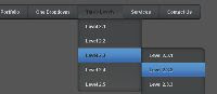
Last step, save the gadget and you're done. Now just check your new cool blog and you'll see that the code is good.
I'm sure you know how to modify the feel and look yourself, so i don't tell you anything about it.
Have a nice day everybody. :)
0 comments:
Post a Comment